For those that have been following my DIY custom modular synth project for a while, you’ll realise it’s almost time to start designing the custom enclosure and front panel. I have a rough idea of what I want, but thought I’d do some research and gather my thoughts on the front panel design of synthesizers.
I’ve always loved the look of hardware, not just in synthesizers but in other audio equipment as well. They inspire you to play them, and give the sound a physical presence in the world. They become not just a tool that makes sound, but a musical instrument.
In this post I’ll attempt to find common threads in design across different synths and identify those styles. During this process I hope solidify what my style and inspirations will be for my project, for any other synths I build in the future. By no means shall this post attempt to be comprehensive.
Note: I was hoping that the book Push Turn Move would be out by the time I got around to designing my synth. If your interested in this topic I highly suggest you look at getting a copy.
Classic black
Going back to the dawn of synthesis, the initial Moog modulars on the East coast and the subsequent Minimoog Model D, offered what has become the archetypal synth look; a set of fluted black knobs with silver inserts on a black panel. Interestingly the style of switches seems to have gone out of favour for pushbuttons or small metal switches like on the Doepfer hardware.

Moog Minimoog front panel
You can see the linage on the Doepfer Dark Energy, or some of their vintage version modules. It even shares the sans serif style fonts.
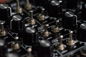
Doepfer Dark Energy font panel
Of course Doepfer aren’t the only ones to be inspired by this style. Check our GRP synthesizers A4 and a panel from synthesizers.com, both of which have added minute like indicators around the knob. There’s also the Synthesis Technology MOTM range and the new Roland SE-02 which share these characteristics.
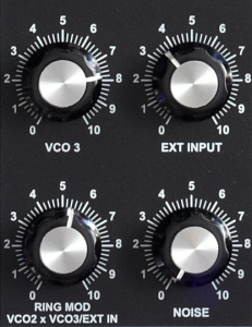
GRP A4 panel
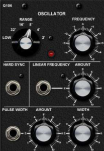
Synthesizers dot com panel
Rocked out
Of course there’s other sides to the spectrum, and some modern modular manufacturers have added some edge to their designs.
In terms of the linage mentioned above, you can clearly see this on some of the Dreadbox synths such as the NYX, whilst introducing other colours and graphic such as on their DRIPS module. This culminates in their White Line series where you see a single fluted knob with literally edgy graphics.

Dreadbox White Line LFO
Where this starts to rock out is when you compare it some band logos like Metallica, and the similarity in the jagged edges become apparent. Probably not too much of a coincidence when you consider Dreadbox started out in guitar pedals.

Metallica logo
But going back further from Dreadbox, Make Noise have made great strides in the design of their panels. Take a look at a version of the Make Noise Maths below and it has the same jagged lightning marks.
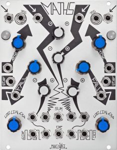
Make Noise Maths
Make Noise continue this theme with their unique edgy font, and have added lines to represent pre-wired signal paths and backlit LED indicators, as shown in their 0-Coast here. For me they make some of the best designed synthesizers available today.
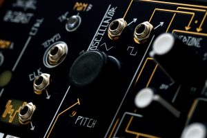
Make Noise 0-Coast Oscillator
Splashes of colour
Mutable Instruments has become another well known brand in the DIY and modular markets. A while ago I stumbled across this post over at Muff Wigglers where Olivier shares the ideas about the design process, taking images that inspired him and translating them into mood boards, which he and his designer turned into the fine brand and products you see today. I highly suggest you read the post, and it’s a good design process I plan to follow myself. You can also see his inspiration from other brands like Make Noise, Buchla and Intellijel.
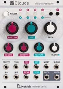
Mutable Instruments Clouds
Another cool manufacturer I discovered recently, who also use colour to highlight their panels are Sonic Portions. In the case of their new Malaclypse module, the octopus graphic looking almost like an Indian deity, again tying it closer to the Mutable products.
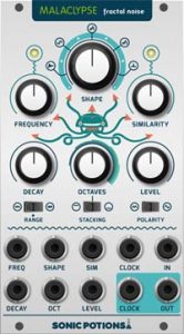
Sonic Portions Malaclypse
Update 01/08/2017: It’s been brought to my attention via Facebook that Papernoise is in fact responsible for working on the Mutable and Sonic Portion designs, and indeed Mutable mention them and their designer Hannes on the Muff Wigglers post. They also do album art, posters, software and more. Thanks to Nonlinear Circuits for pointing this out.
More Modern Modular Beauties
QU-Bit Electronix and Audio Damage also make some simple yet beautifully executed modules, the QU-Bit taking on a somewhat minimal design, whilst the Audio Damage is more compact and graphic heavy. Like the Mutable and Sonic examples above, shading is employed over some of the jacks to separate them from others, such as outputs.
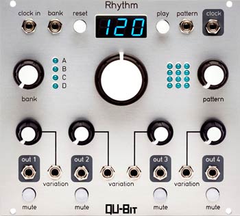
QU-Bit Rhythm
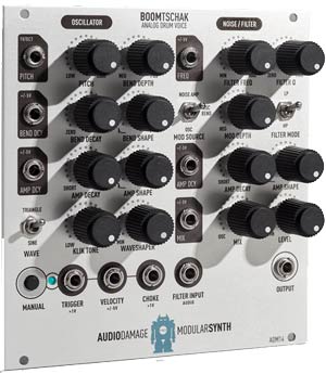
Audio Damage Boomtschak
Wild Britain
The English are known more for being reserved, but some of the British synth offerings are the wildest around.
The inspiration of the Wasp is pretty clear. The black and yellow colours of a wasp, and lots of it including all over the conductive keyboard. It made for both one of the ugliest and retrospectively cool pieces of gear around. The Wasp filter sounded as distinct as it looked, and has since been cloned including by Doepfer (including an edition with the same colours) and Random Source Haible.
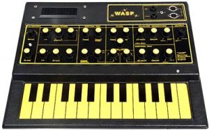
EDP Wasp with it’s standout colour scheme
The other crazy looking synth was the OSCar. Not so much for it’s colours, although the beige was an odd choice, but the dividers separating parts of the synth, and large text in case your ever forgot what you were playing. Like the Wasp the OSCar ended up as a splendidly ugly yet desirable synth.
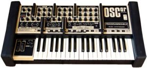
OSCcar shown with it’s unique dividers
Another unique English synthesizer was the EMS Synthi range, with it’s battleship game style modular pin routing system. But what strikes me about it was the scientific looking knobs, which set it apart from it’s American and Japanese counterparts.
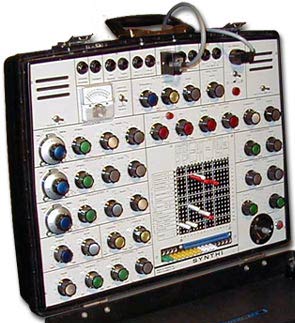
EMS Synthi AKS
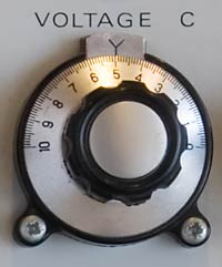
EMS style knob
The mark of the EMS design can be seen today in the Scottish Macbeth Elements, from the grey panel to the unique knobs, and even the touch keyboard from the Wasp and EMS synths.
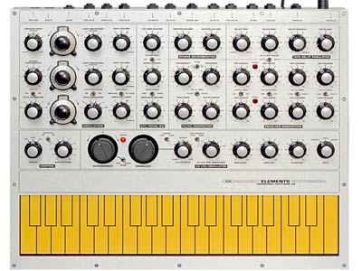
Macbeth Elements
Grouped functions
I’ll finish off with a mention of graphic styling used to group functions, like an oscillator section or the filter. The first example is the renowned ARP 2600.
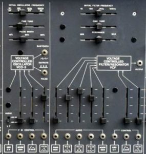
ARP 2600 panel
This as also common in other synths of the era, such as one of my personal faves, the Oberheim SEM (the curved borders were copied over to the early millennial Oberheim/Viscount OB12 Italian VA), and later the famous Roland Jupiter 8 which used brilliantly coloured pushbuttons.
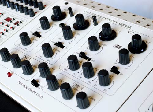
Oberheim SEM
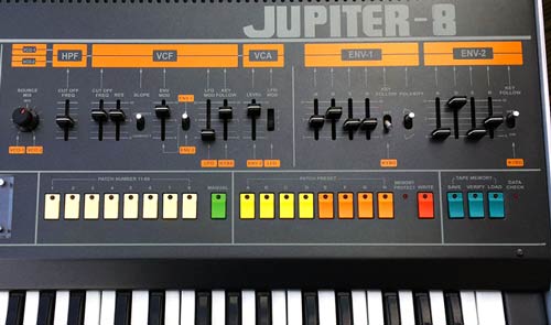
Roland Jupiter 8 panel
Conclusion
I could keep going forever here, from the unique blue stripes of the Oberheims, to the unique ARP orange on black markings, and the silver Roland TB-303, there’s been plenty of synthesizers that have left their visual mark on me. Using all this inspiration I’m excited to see what I come up with for my custom synthesizer.
Lastly, in addition to Push Turn Move, I also suggest picking up a copy of R is for Roland. This book features great photos of some of Roland’s best work, and is an excellent source of inspiration for any designer.

